A Comprehensive Guide to Road Traffic Control Equipment
Read more...
Author: Workshop360 Date Posted:5 September 2022

Safety signs are necessary in all workplaces. They are there to protect against the risks and hazards of all workplaces, from industrial sites with heavy machinery to office cubicles with paper and printers. So, if you run a workplace or are employed in one, it’s definitely worth knowing more about the 10 most common types of safety signs and meanings in Australia.
Have you ever stopped to wonder why exit signs are green and fire signs are red? Or why the classic “slippery when wet” signs are yellow and black and why fully-carpeted offices still seem to have them? (Do they mop the carpet?!) It turns out there are reasons for all of it and, if you’re looking to add signage to your workplace, it’s vital to know what they are.
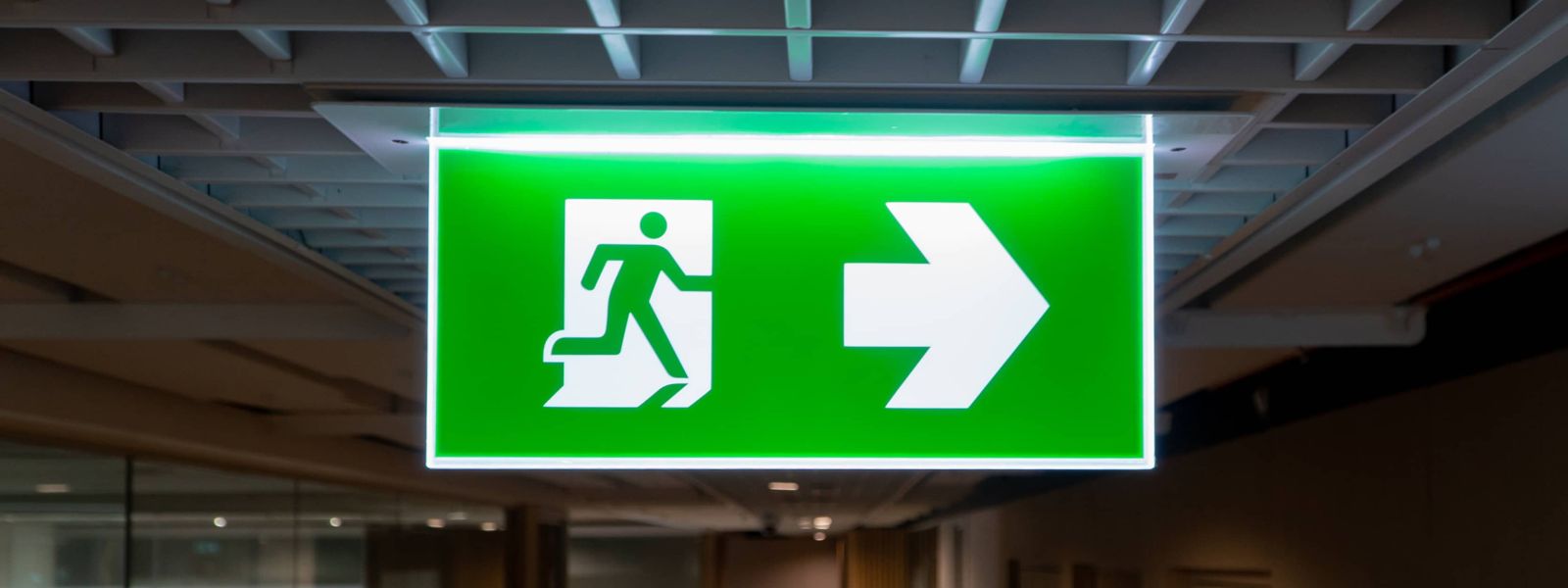
The first type of sign is the emergency information sign. These ones are for guiding people in an emergency or workplace accident, ranging from a full-blown fire to an eye injury or chemical spill. Under Australian standard signage, these are green, and for good reason.

Colour is very important to safety signs. A prime example of emergency information signs is the common exit sign. There are a couple of reasons why the exit sign is green, the first of which is simply being able to see it. The human eye is better at picking up the vivid green of a well-lit exit sign than, for instance, dull red (a colour which is still commonly used in the USA for exit signs).
Also, green is associated with safety, such as green traffic lights to signal that it’s safe to cross an intersection. In an emergency, it’s easier to rely on the instinct that green means go, and it is often required by the work safe standards for these signs to be illuminated.
A common theme on all the safety signs is the use of contrasting colours, so the sign is easy to read quickly. For this reason, white is used for pictograms and text on green emergency info signs because it stands out.
Maybe these blocky colours don’t tickle one’s creative spirit and there may be a lovely shade of dark green that matches the bright green just right, but I doubt people will appreciate the artistry when they’re stuck inside a burning building. (Well, unless it’s a really nice dark green). Of course, there are people who are red-green colourblind, which is where pictograms come in.
Pictograms are the images on signs, instead of the text. Often, they are stick figures or very simplified designs of what they represent to get their point across clearly. A classic example is the running man pictogram used on one of the most common safety signs: exit signs.
They say that pictures are worth a thousand words but, thankfully, they don’t take nearly that long to read. Pictograms are much easier to understand quickly than writing, especially in a high-pressure situation. People become scared and confused under duress which makes reading harder. Even if exit is only a four-letter word, there are plenty of other four-letter words people are already using when they’re running from a fire. So, the running man pictogram gets the message across more easily.
Also, the running man on green exit signs, unlike the word ‘exit’ itself, can be understood universally whether the person trying to read it understands English or not. The point of safety signs is to be as clear and obvious as possible, no matter who is reading it.
There are other examples of green signs other than exit, such as for emergency eyewash stations or first aid kits (we have a blog on those, too). These don’t have to be illuminated but they do feature nice and distinct pictograms like the classic medical plus (or cross) symbol for first aid and the eye shower which is literally an eye under a shower (which goes to show pictograms don’t have to be literal because either that’s a massive eye or a tiny shower).
Another type of sign is a fire sign. You might think these would be like wet floor signs since fire and water seem related. But while it makes sense to put a wet floor sign up next to a wet floor, it doesn’t make quite as much sense to put up a fire sign next to a fire. For one thing, you’d really need a lot of signs as the fire spreads. Plus, the best thing to do when a fire starts is to alert everyone and evacuate, so who would be around to put the signs up?

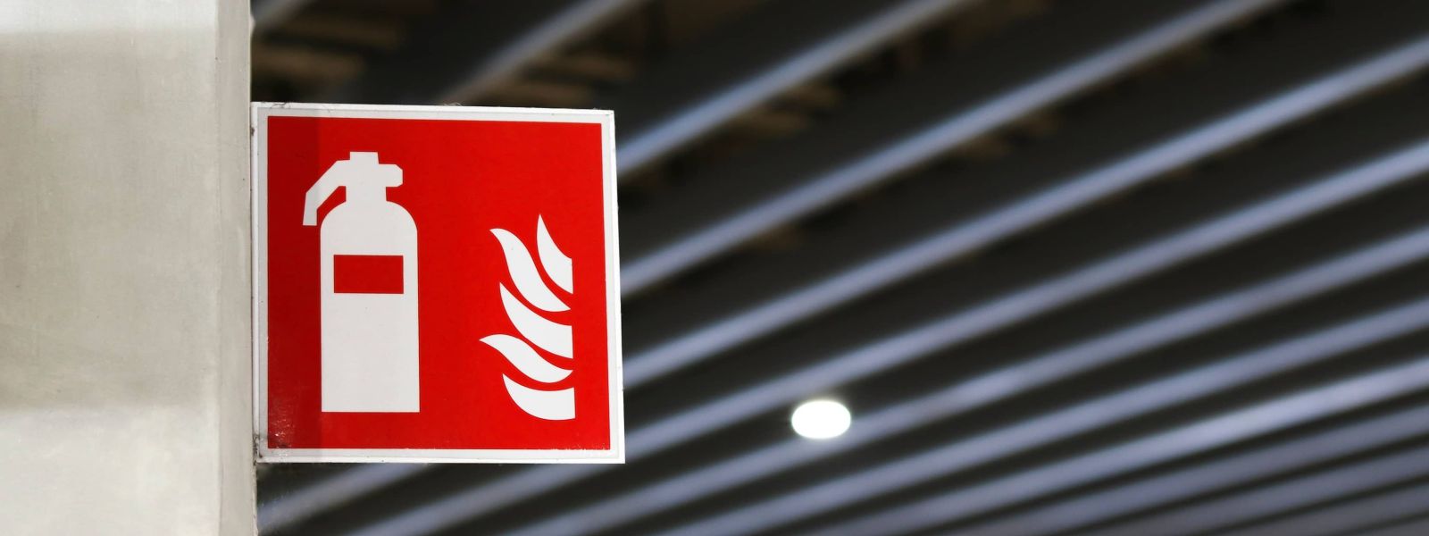
But, in all seriousness, these are used for locating fire extinguishers or other fire-fighting devices like fire alarms or sprinklers and can show pictograms of the device in question. As per the agreed upon safety signs and meanings Australia, they have a red background and white pictograms and text, again for high contrast. There isn’t much else to say about these signs because they are pretty clear on their own. Fire signs are red because… fire is also red.
There is another category of signs called regulatory signs. There are three groups of signs that fall into this category: prohibition signs (big no-noes), mandatory signs (big yes-yesses), and limitation/restriction signs (used for setting a limit on an activity, like speed limit signs. In other works, they basically they say at what point the yes-yes becomes a no-no).
An example of a prohibition sign is a no smoking sign or a no photography sign. These are red circles with a red diagonal slash over a white background. Then there is a black pictogram of the offending activity (such as a cigarette to indicate smoking, a person to indicate no entry, or a ghost to indicate Ghostbusters) that is covered by the red slash. They can be accompanied by text but usually only if the pictogram might be a bit harder to understand or it’s less common.
These signs are for activities that are not permitted whether it is because they are illegal or because they go against the safety procedures in place at the worksite. Unfortunately, no one has yet designed a sign prohibiting silly buggers. This is probably because no one has found the right pictogram yet.
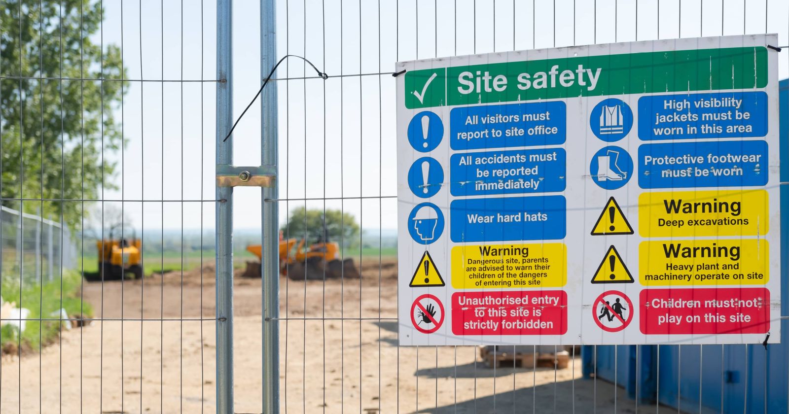
An example of a mandatory sign is a hard hat required sign or a hearing protection required sign. These signs are blue circles with white pictograms of what is required on them. A common example where these can be found is building sites where appropriate footwear, hard hats and sometimes ear and eye protection is required for entry.
Limitation signs are just like prohibition signs but without the red slash: red circles with white backgrounds and black text or pictograms inside. An example most people would be familiar with is speed limit signs. Another is height restrictions on vehicles, although, road warning signs are often yellow, diamond-shaped signs which have their own standards. These height restriction signs are more likely to be used for forklifts, or elevated working platforms like scissor lifts or cherry pickers.
The last category of signs is the most important – hazard signs. There are DANGER signs which are for a hazardous situation which is potentially life threatening. And there are warning signs for hazards that are not. This makes it pretty important to know the difference between DANGER and hazard symbols in Australia.
This may seem like a difficult distinction to make. For instance, a “slippery when wet” sign is usually just a warning, but in the hands of someone like Mr Bean a mop is a weapon of chaos. And while a DANGER sign declaring that demolition work is in progress might strike mortal fear into most of us, for the likes of Mr Magoo it goes unheeded. But, for everyone else, clearly, it’s a case where good old fashioned common sense comes in to play.
These signs have two sections. One has a black background with a red oval on it containing the word DANGER in white text. The other has a white background and black text and possibly pictograms referring to the threat, such as high voltage or poison or keep out and so on. However, they usually do not contain pictograms, so when making custom signs be aware of possible misunderstanding. For instance, a pictogram of welding with the goggles and sparks is much harder to misinterpret than just the text “warning: welder’s flash” which might be taken quite differently.
Warning signs have a yellow background and a black pictogram which is often bordered by a triangle and accompanied by black text. This includes the famous slippery-when-wet sign as well as more serious signs like welding-in-progress and forklift in use. (I have yet to meet a person who can weld and drive a forklift at the same time, but I would certainly hope there was a warning sign if I did.)
Also included in this category are signs which are everywhere in between, like pinch point, which you may have seen, which has a pictogram of fingers being squashed between gears That always makes me feel very uncomfortable (it would definitely keep me clear from the pinch point though, so I guess job done.)

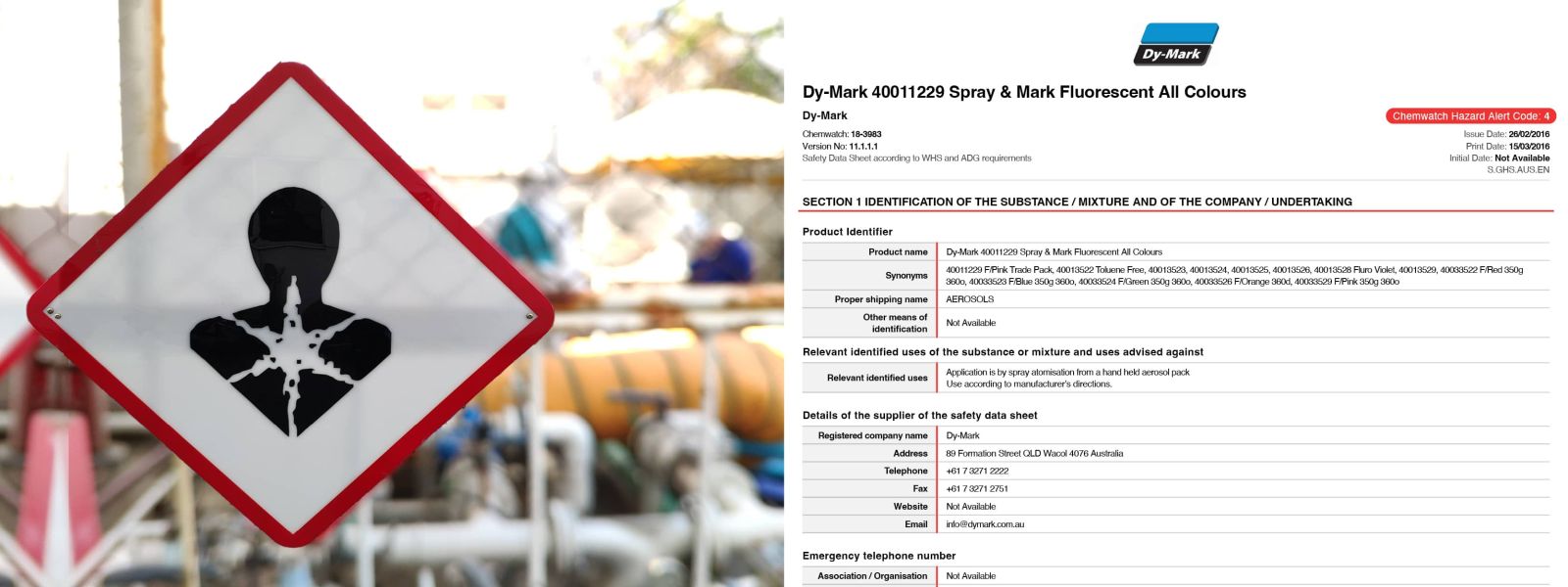
While the previous sections cover the common safety signs and meanings of Australian workplaces, another aspect is the materials themselves. The Globally Harmonised System of classification and labelling (GHS) is important as well. These pictograms can be found on things like tins of paint which may be poisonous or toxic to the environment and consist of a red diamond shape with a white background and a black pictogram in the middle.
The classic one is a skull and cross bones to show something is toxic to eat or even potentially to inhale. The pictogram of a dead fish in a river with a leafless tree can be for aquatic toxicity or hazardous to the environment. One you may not be familiar with is the shape of a human which appears to be dissolving from the inside out. This can mean anything from respiratory issues to organ toxicity.
These pictograms cover a lot of issues but are useful to indicate a base level of danger to users. Each product then needs to have a Material Data Safety Sheet (MSDS or just SDS) which provides details on the exact hazards of the material as well as any requirements for storage or disposal. And I know what you’re thinking, “great, more paperwork”, but until we get that prohibition of silly buggers sign going, it’s the best thing we’ve got to stop people dissolving from the inside out.
The Australian Dangerous Goods (ADG) Code is used for transportation. A common place to see these signs is on the front and back of trucks. Most of these signs have pictograms that make them self-explanatory but there is one that doesn’t feature any pictograms and is used for miscellaneous dangerous goods, known as category 9 of hazardous materials. It has a white background and the top half has black, vertical lines. It’s used for things that don’t fit into other categories like dry ice which can cause your skin to freeze so badly it seems like a burn and asbestos which we all know and love to hate (because it causes lung cancer).
A lot of online sign shops (including WorkShop360 *wink wink*) sell signs that have a blank space for you to paint your own message on. They also have stencils for lettering and pictograms, and rollers and ink to make this process as convenient as possible. Now that you know the 10 common safety signs in Australian standard signage and why they have the colours and shapes they do, you can make your own custom signs as clear as possible, as well as knowing which of the standard signs are right for you.
Of course, it’s vital that these important safety signs be visible to employees. Making sure they are placed in an area that is in the right position for viewing that isn’t too high or too low and is well lit enough to see, as well as making sure nothing is or can be stacked up in front of them. Also, it’s important the employees understand what signs mean, so making sure to tell them is a good idea. Fire drills are a good chance to make sure that all safety signs are visible and are understood by employees. It’s also a useful time to ask if any of your employees are colourblind.
---
Safety signs are necessary in all workplaces. They communicate ideas that are critical to the proper functioning of a workplace quickly and easily by showing what is allowed, what isn’t allowed, and where the line between them is. They serve as warnings of potential hazards, where to find equipment to deal with a situation when a hazard becomes a problem, and where to go for safety when a problem is out of control. If you were looking for a sign that your workplace needs some signage, here it is.

Read more...

Read more...

Read more...

Read more...

Read more...

Subscribe to our newsletter to get exclusive deals and updates!
 Afterpay
 Bank Deposit
 PayPal Express
 Web Payments
 Web Payments
 MasterCard
 Visa
VisaWelcome to our website. If you continue to browse and use this website, you are agreeing to comply with and be bound by the following terms and conditions of use, which together with our privacy policy govern EagleXP T/A Workshop360’s relationship with you in relation to this website. If you disagree with any part of these terms and conditions, please do not use our website.
The term ‘EagleXP T/A Workshop360’ or ‘us’ or ‘we’ refers to the owner of the website whose registered office is Unit 1, 18 Gravel Pit Road, Darra, QLD, 4076. Our ABN is 14 622 985 068. The term ‘you’ refers to the user or viewer of our website.
The use of this website is subject to the following terms of use:
This Privacy Policy describes how your personal information is collected, used, and shared when you visit or make a purchase from www.workshop360.com.au (the “Site”).
When you visit the Site, we automatically collect certain information about your device, including information about your web browser, IP address, time zone, and some of the cookies that are installed on your device. Additionally, as you browse the Site, we collect information about the individual web pages or products that you view, what websites or search terms referred you to the Site, and information about how you interact with the Site. We refer to this automatically collected information as “Device Information”.
We collect Device Information using the following technologies:
Additionally, when you make a purchase or attempt to make a purchase through the Site, we collect certain information from you, including your name, billing address, shipping address, payment information (including credit card numbers & payment account numbers Paypal, Afterpay, ZipPay), email address, and phone number. We refer to this information as “Order Information”.
When we talk about “Personal Information” in this Privacy Policy, we are talking both about Device Information and Order Information.
We use the Order Information that we collect generally to fulfil any orders placed through the Site (including processing your payment information, arranging for shipping, and providing you with invoices and/or order confirmations). Additionally, we use this order information to:
We use the Device Information that we collect to help us screen for potential risk and fraud (in particular, your IP address), and more generally to improve and optimize our Site (for example, by generating analytics about how our customers browse and interact with the Site, and to assess the success of our marketing and advertising campaigns).
We share your Personal Information with third parties to help us use your Personal Information, as described above.
We also use Google Analytics to help us understand how our customers use the Site-you can read more about how Google uses your Personal Information here: https://www.google.com/intl/en/policies/privacy/. You can also opt-out of Google Analytics here: https://tools.google.com/dlpage/gaoptout.
Lastly, we may also share your Personal Information to comply with applicable laws and regulations, to respond to a subpoena, search warrant or other lawful request for information we receive, or to otherwise protect our rights.
As described above, we use your Personal Information to provide you with targeted advertisements or marketing communications we believe may be of interest to you. For more information about how targeted advertising works, you can visit the Network Advertising Initiative’s (“NAI”) educational page at http://www.networkadvertising.org/understanding-online-advertising/how-does-it-work.
You can opt out of targeted advertising by:
Facebook - https://www.facebook.com/settings/?tab=ads
Google - https://www.google.com/settings/ads/anonymous
Bing - https://advertise.bingads.microsoft.com/en-us/resources/policies/personalized-ads
Additionally, you can opt-out of some of these services by visiting the Digital Advertising Alliance’s opt-out portal at: http://optout.aboutads.info/.
You can also do a blanket opt-out of targeted advertising at http://www.youronlinechoices.com.au/ for companies who have signed up to “Your Online Choices”.
This website uses the Google AdWords remarketing service to advertise on third party websites (including Google) to previous visitors to our site. It could mean that we advertise to previous visitors who have completed a task on our site, for example using the contact form to make an enquiry or making a purchase.
This could be in the form of an advertisement on the Google search results page, or a site in the Google Display Network. Third-party vendors, including Google, use cookies to serve ads based on someone’s past visits to this website. Of course, any data collected will be used in accordance with our own privacy policy and Google’s privacy policy.
You can set preferences for how Google advertises to you using the Google Ad Preferences page.
Please note that we do not alter our Site’s data collection and use practices when we see a Do Not Track signal from your browser.
Under Australia Consumer Law you are entitled to rights regarding the collection and usage of your information. For more information on your rights visit the ACCC website: www.accc.gov.au
When you place an order through the Site, we will maintain your Order Information for our records unless and until you ask us to delete this information.
We may update this privacy policy from time to time in order to reflect, for example, changes to our practices or for other operational, legal or regulatory reasons.
For more information about our privacy practices, if you have questions, or if you would like to make a complaint, please contact us by e-mail at admin@workshop360.com.au or by mail using the details provided below:
Unit 1/18 Gravel Pit Road, DARRA, QLD, 4076, AUSTRALIA


Add your favourites to cart

Select Afterpay at checkout

Log into or create your Afterpay account, with instant approval decision

Your purchase will be split into 4 payments, payable every 2 weeks
All you need to apply is to have a debit or credit card, to be over 18 years of age, and to be a resident of country offering Afterpay
Late fees and additional eligibility criteria apply. The first payment may be due at the time of purchase
For complete terms visit afterpay.com/terms


